


 ChatGPT
 Perplexity
 Google AI
 Grok
Grok Claude
You do not need a large budget to create a home that looks considered and expensive. But certain interior design decisions will undermine even the nicest spaces — sometimes in ways that are hard to identify but immediately felt. After working with hundreds of homeowners across Bangalore over 15 years, these are the ten mistakes we see most consistently, and what to do about each one.
Quick Summary
- Poor lighting is the single fastest way to cheapen any room — it is also the easiest to fix
- Furniture that is the wrong scale for the room is more damaging than cheap furniture in the right scale
- Matching every piece of furniture in a room makes it look like a showroom, not a home
- The 60-30-10 colour rule prevents the most common paint mistakes without requiring design expertise
- Artwork hung too high is one of the most common mistakes in Indian homes and takes 10 minutes to fix
Keep reading for the full breakdown on each.
Why Small Details Make the Biggest Difference
The difference between a room that feels expensive and one that does not is rarely one big thing. It is usually five or six small things happening simultaneously — the wrong lighting, the wrong scale, the wrong colour temperature, hardware that does not match. Each individually is minor. Together they add up to a room that feels off in a way that is hard to name.
This is also why fixing these mistakes is so high-leverage. Addressing lighting, scale, and hardware in a room you already have costs a fraction of new furniture and makes a bigger difference than any single piece.
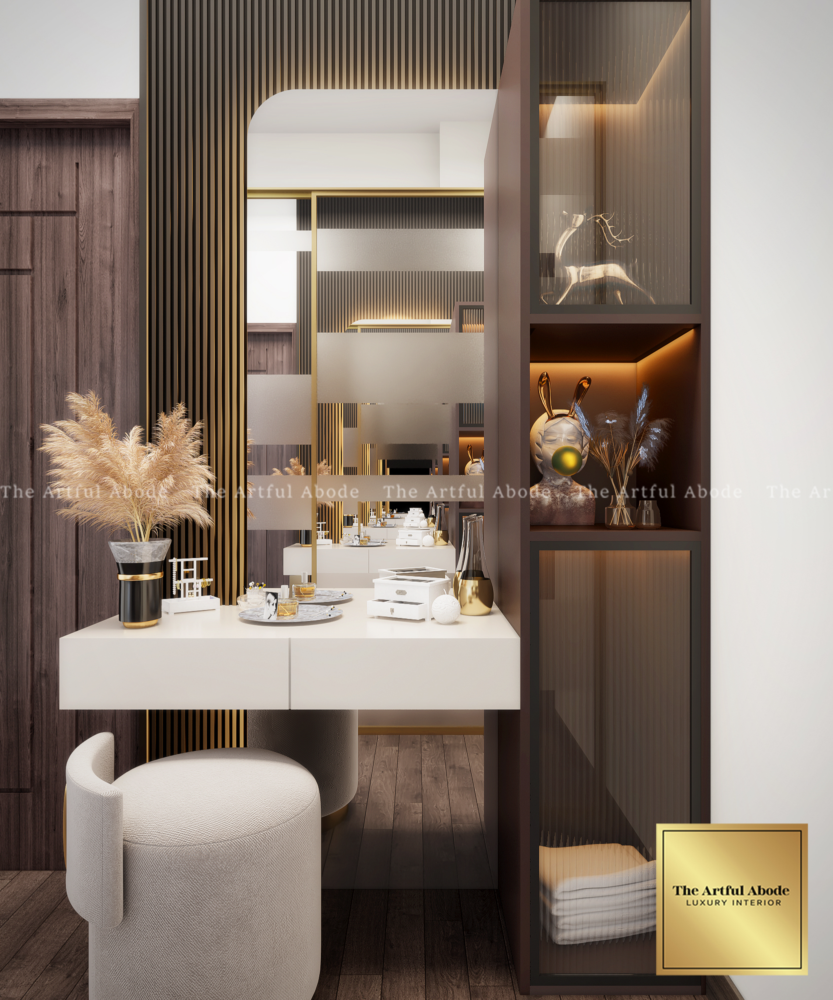
Covering surfaces with small accessories, baubles, and ornaments creates visual noise that prevents the eye from landing anywhere specific. The room cannot communicate a point of view because there are too many competing for attention.
Group items in odd numbers (the rule of three) with clear space between groupings. Replace 20 small pieces with 2 to 3 genuinely good ones. In a living room, spend on 2 statement objects rather than a collection of small ones. The empty space between objects is part of the composition.
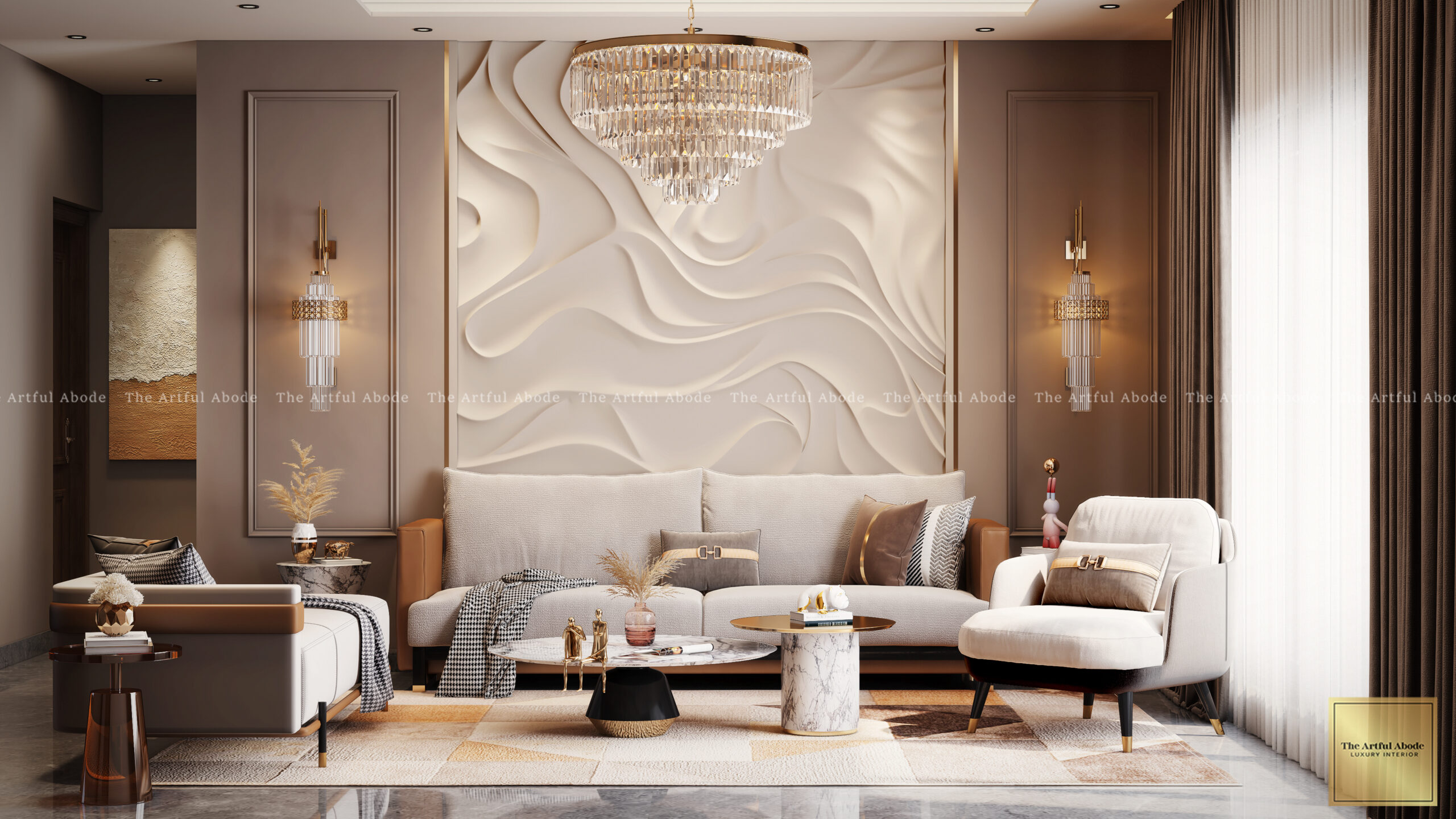
Dependence on a single overhead light or the wrong colour temperature bulb flattens space, hardens materials, and makes even premium surfaces look artificial. Lighting alone can affect a home's perceived value by as much as 20%.
Layer your lighting. Ambient for overall illumination, task lighting for reading and work surfaces, accent lighting for architectural details and art. Use warm white bulbs (2700K to 3000K) in living areas and bedrooms. Add table lamps, floor lamps, and wall sconces to create warmth from the sides rather than just overhead.
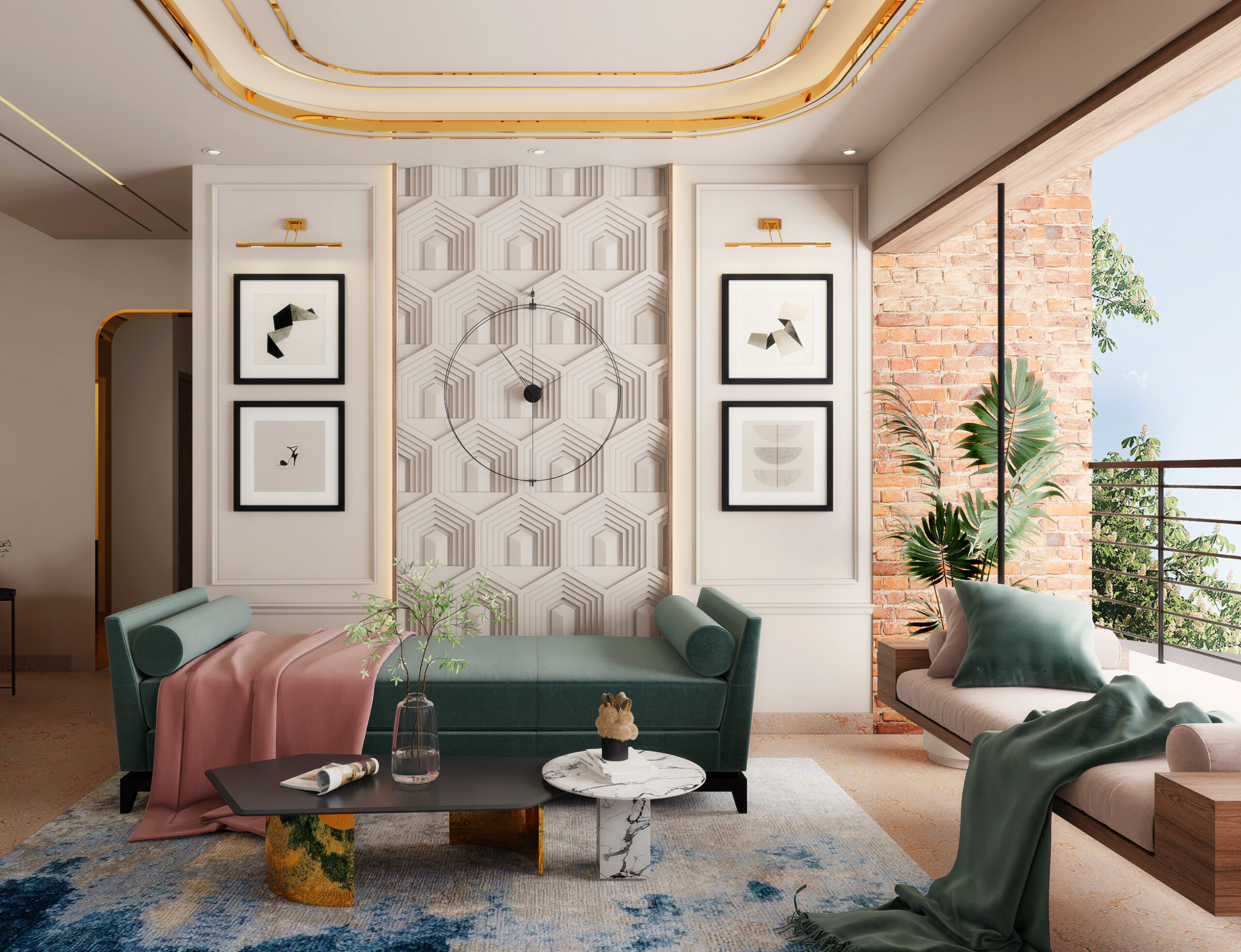
A sofa that is too small for the room floats awkwardly. A coffee table that is too large dominates and crowds. Getting scale wrong is more damaging to a room than having furniture that is less expensive but correctly proportioned.
Your coffee table should be roughly two-thirds the length of your sofa. Area rugs should be large enough for at least the front legs of all furniture to rest on them — the most common rug mistake in Indian living rooms is a rug that is simply too small. Allow 45 to 60 cm of walkway clearance around furniture. Measure before purchasing; do not trust your eye alone.
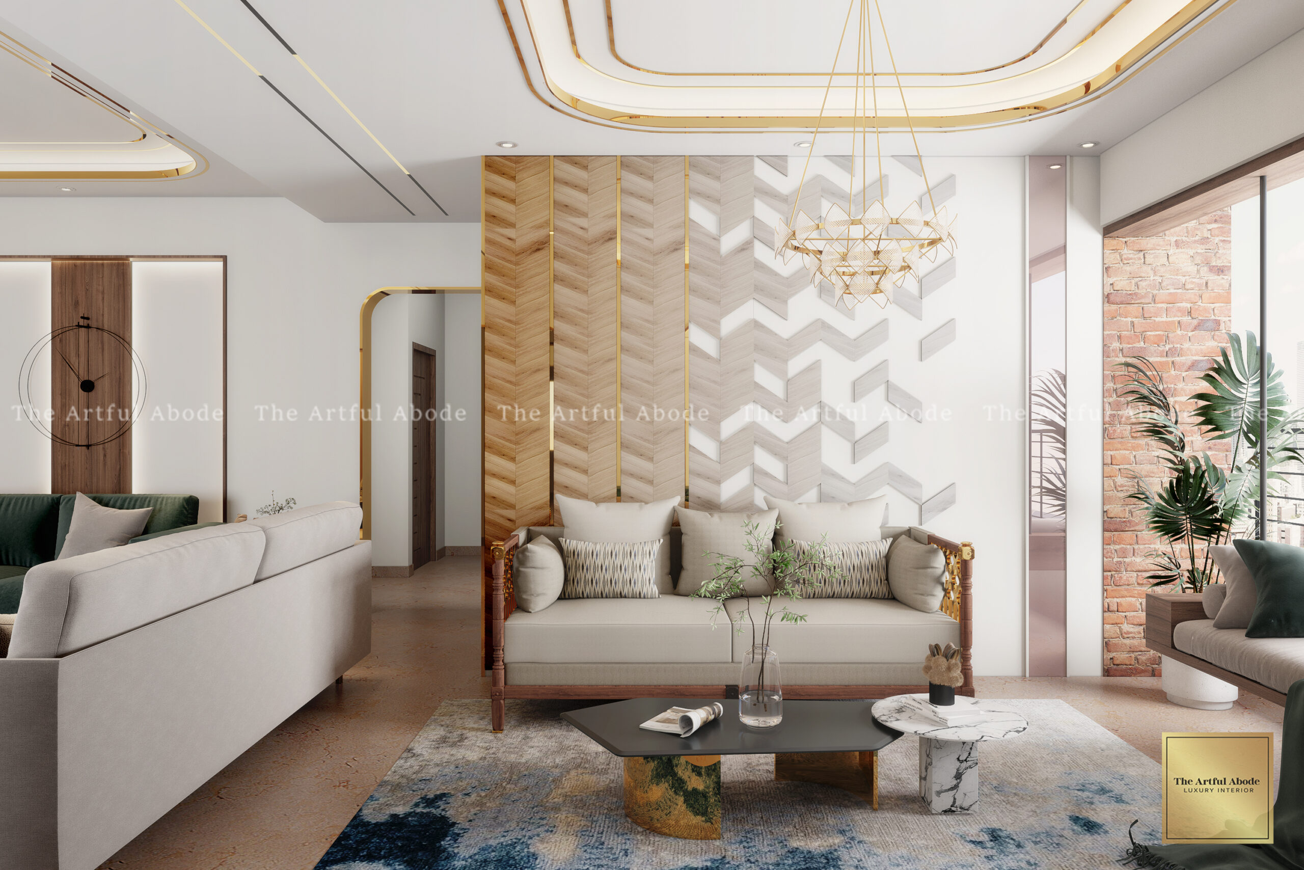
Too bright, too dark, or poorly sequenced colours across a home make rooms feel smaller, disconnected, or visually disturbing. Colour mistakes can undo the effect of everything else in the room.
Use the 60-30-10 rule — 60% dominant neutral tone, 30% secondary tone, 10% accent. Always test paint colours under multiple lighting conditions before final selection: morning light, afternoon light, and evening with artificial lighting. A colour that looks perfect in the paint store can behave entirely differently on a large wall under actual conditions.
Artwork hung too high creates uncomfortable visual gaps between the piece and the furniture below it, making the room feel disconnected and tall in the wrong way. This is one of the most common mistakes we see in Indian homes across all budget levels.
Hang artwork at eye level — typically 57 to 60 inches from the floor to the centre of the piece. For gallery walls, leave 5 to 8 cm between frames for visual flow. The artwork should feel related to the furniture below it, not floating independently on the wall.
Want an honest assessment of what is working and what is not in your current space? The Artful Abode offers design consultations across Bangalore — no commitment required.
Book a Free Consultation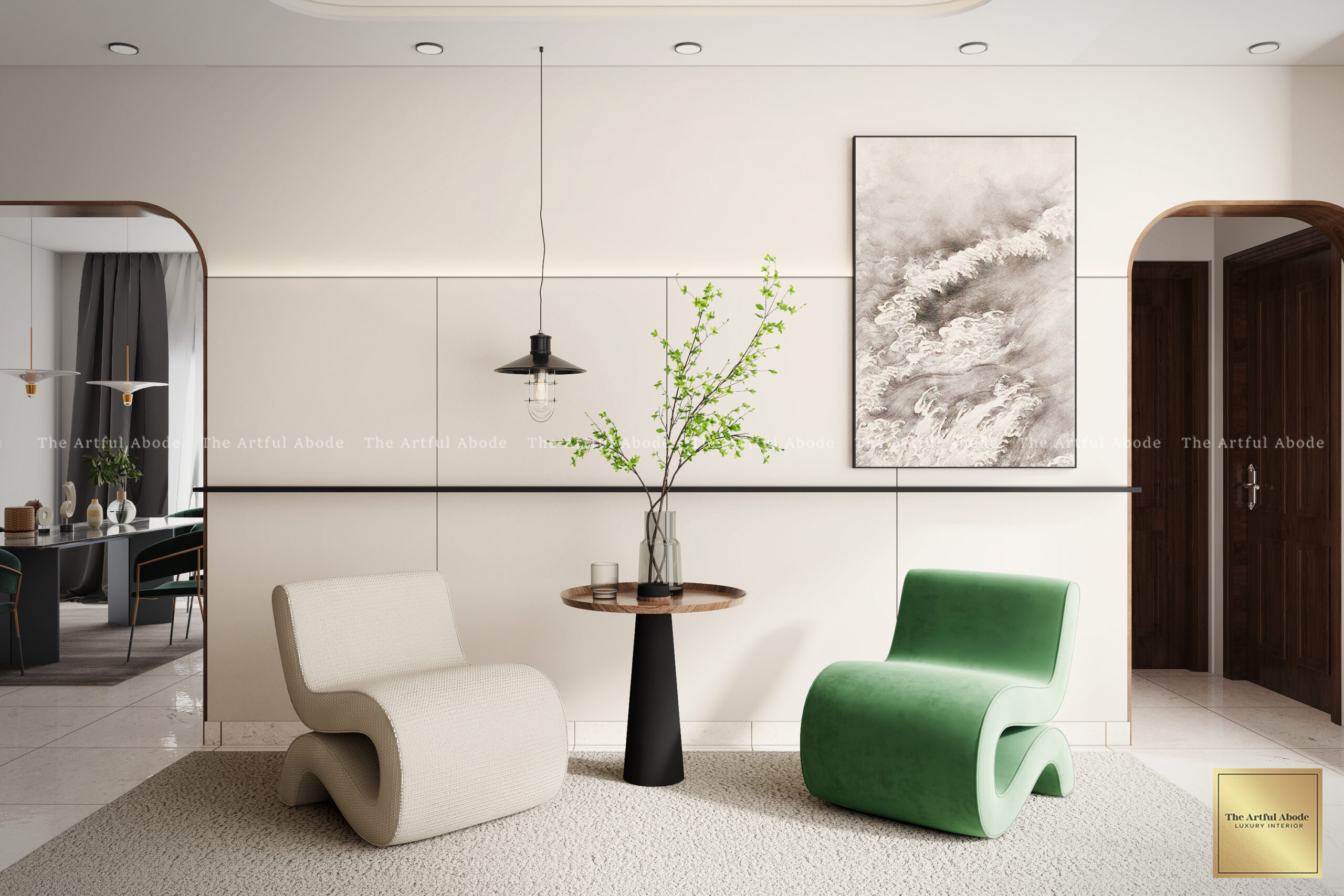
Artificial greenery of poor quality leaves an immediate impression of cost-cutting. Cheap fake plants collect dust visibly, lack the natural variation of real plants, and signal to anyone who looks closely that the home is not what it presents itself to be.
Use real plants adapted to your actual lighting conditions. Snake plants, pothos, ZZ plants, and peace lilies all perform well in the varied light conditions of Indian apartments with minimal care. For spaces where real plants are genuinely not viable, use very high-quality artificial plants only in locations where they will not be examined closely.
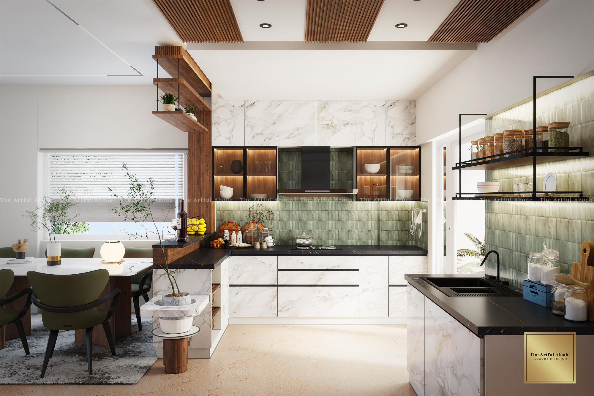
Mixing hardware finishes haphazardly, or using builder-grade handles and pulls throughout a home, undermines every other design decision in the room. Hardware is the jewellery of a space — the detail people touch and notice up close, even when they cannot name what they are reacting to.
Commit to 2 to 3 finishes maximum and use them consistently — brushed gold, matte black, and warm brass are all popular and work well together in the right combinations. Replace cabinet pulls, door handles, and light switch plates. This is one of the highest-impact, lowest-cost upgrades in any room.
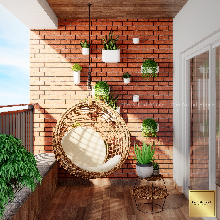
Bare windows, cheap blinds, or curtains hung at window height rather than ceiling height make rooms look incomplete. Windows are architectural features. How they are dressed communicates whether the room was finished intentionally or just abandoned.
Hang curtains close to the ceiling and extend the rod at least 30 cm beyond the window frame on each side. This makes the window appear larger and the ceiling appear higher. Use quality fabrics with sufficient weight to hang properly. Layer blinds with curtains for light control and layered texture. Quality window treatments can add 12 to 15% to perceived home value.
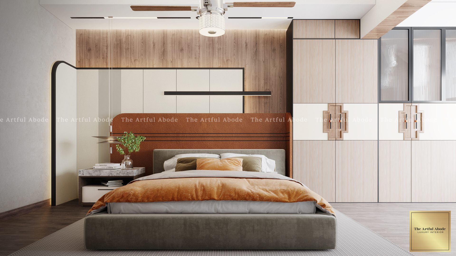
Buying a matched furniture set — sofa, coffee table, side tables all from the same collection — creates a room that looks like a display floor. It signals that choices were made by someone else, not by you.
Mix styles, finishes, and textures deliberately. Pair a modern sofa with a vintage side table. Mix wood tones intentionally — two or three complementary tones create visual interest. Combine metals where they appear together. The discipline is in the combination: contrast needs to be intentional, not random.
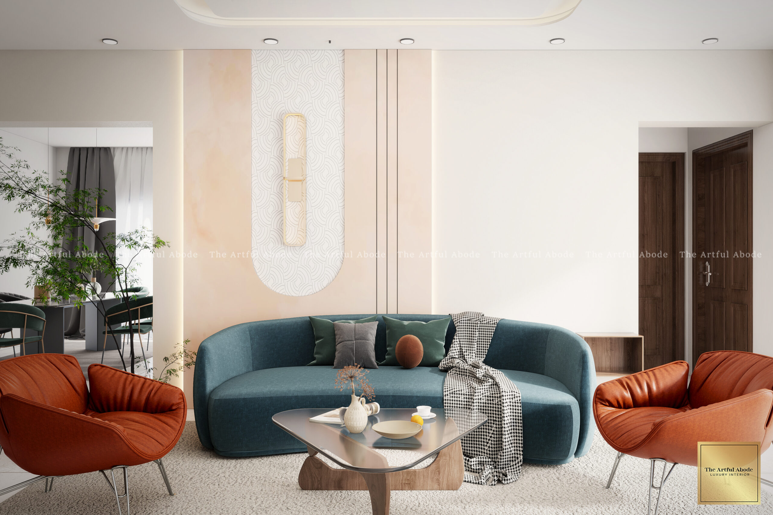
Thin, flat, inexpensive curtains, cushions, and upholstery immediately signal budget decorating. Fabrics are what give a room its warmth, texture, and depth — and poor quality textiles undermine everything else, including furniture that may have cost far more.
Invest in quality textiles with weight and texture. Linen, heavy cotton, velvet, and woven textiles all add depth and richness. Layer multiple textiles in a room — a linen sofa with velvet cushions and a woven throw reads as deliberate and rich. The cost of re-covering cushions in better fabric is typically a fraction of replacing the furniture.
How to Make Your Home Look Expensive Without Spending a Fortune
The pattern across all ten mistakes above: it is not what you buy, it is how it is placed, sized, lit, and combined. The most cost-effective interventions — correct artwork height, better lighting bulbs, larger rugs, consistent hardware — cost almost nothing and change the room immediately.
The bigger investments — quality textiles, proper curtains, a few genuinely good decorative pieces — pay back disproportionately because they anchor a room in a way that budget alternatives cannot.
The Artful Abode offers design consultations for homeowners across Bangalore who want an honest assessment of what is working and what is not in their current spaces. Book yours here — no commitment required.