


 ChatGPT
 Perplexity
 Google AI
 Grok
Grok Claude
Your home should feel intentional. Not like you grabbed whatever was on sale and hoped it worked out. After 12 years of doing this in Bangalore, I have found that most homes fail not because of budget — they fail because of five or six specific decisions that went wrong. Get those right and the rest of it is just details.
Quick Summary
- 60-30-10 colour rule: dominant colour 60%, supporting 30%, accent 10%. Prevents visual chaos.
- Negative space is not empty. It is what makes everything else look considered.
- One ceiling light per room is never enough
- Wrong-sized furniture damages a room more than cheap furniture that fits
- Every room needs a focal point — something the eye lands on and the layout builds around
- Texture contrast stops rooms falling flat even when the colour palette is restrained
Keep reading for the full breakdown on each.
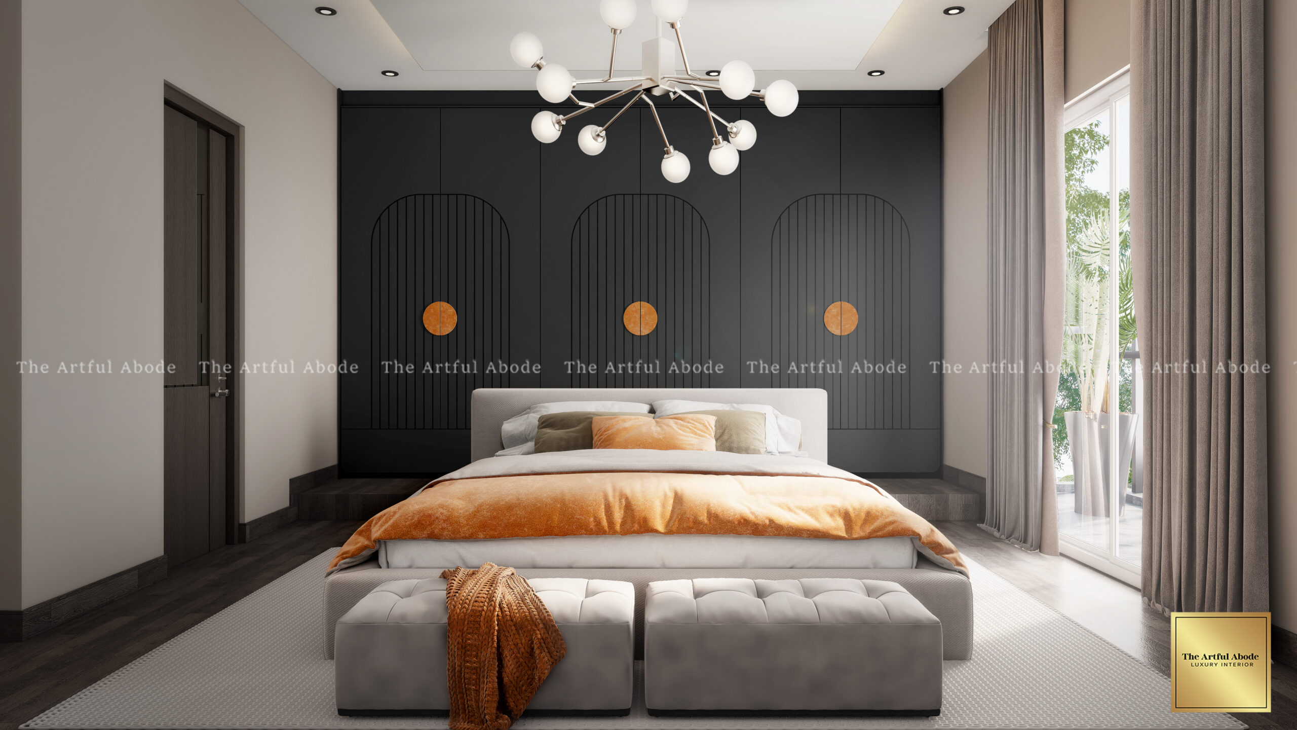
Some rooms just click the moment you walk in. The colours work and you cannot immediately say why. There is usually a formula behind it.
60% to your dominant colour — walls and the largest furniture pieces. 30% to your supporting colour — accent chairs, curtains, a rug. The final 10% is personality — cushions, artwork, things that draw the eye.
Why does this work? Your brain needs visual order. Too many competing colours of equal weight creates a low-level stress in a room — the kind that leaves you feeling tired after spending time in the space without knowing why.
A client in Whitefield once painted three walls in different bold colours she loved individually. Together they gave her headaches — not a metaphor, actual headaches. We simplified to warm grey as the base, brought terracotta through the furniture, kept her cobalt blue obsession alive in accessories. The colours she loved were still there. Just in the right proportions. Room went from overwhelming to peaceful.
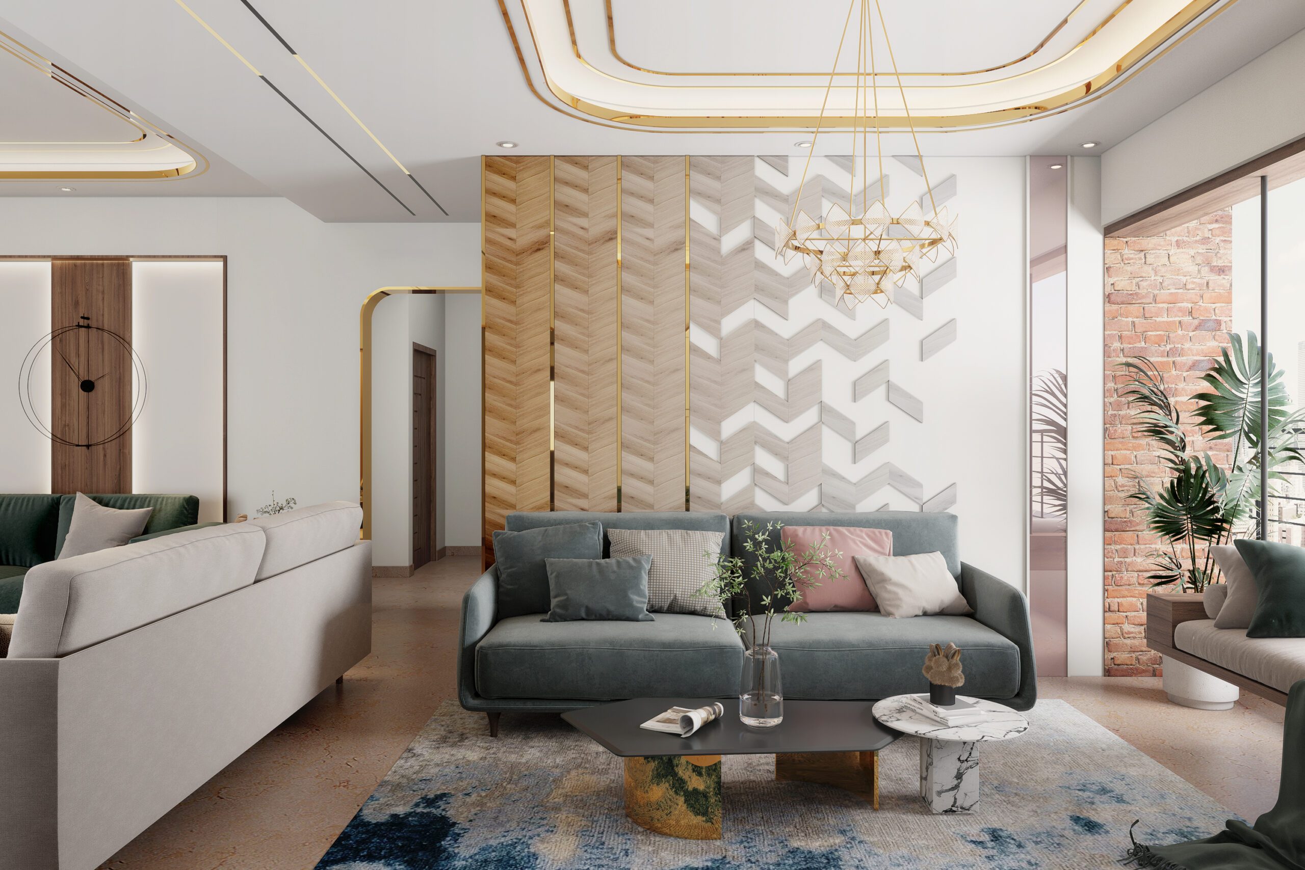
Most people treat bare walls and empty corners as problems to solve. They are not.
When every wall has art, every surface has objects, every corner has furniture, your eye has nowhere to rest. Even expensive pieces start looking cheap when they are competing with everything around them for attention.
Quick wins with negative space:
- Pick one wall to leave mostly bare
- Float furniture away from walls instead of pushing everything against them
- Leave some shelves genuinely empty — not every shelf needs to be filled
- Let a good window do its own work without competing elements around it
In bedrooms especially, this changes everything. When clients let go of filling every inch, the bed becomes the focal point it should be. One strong piece of art actually gets noticed. The room breathes.
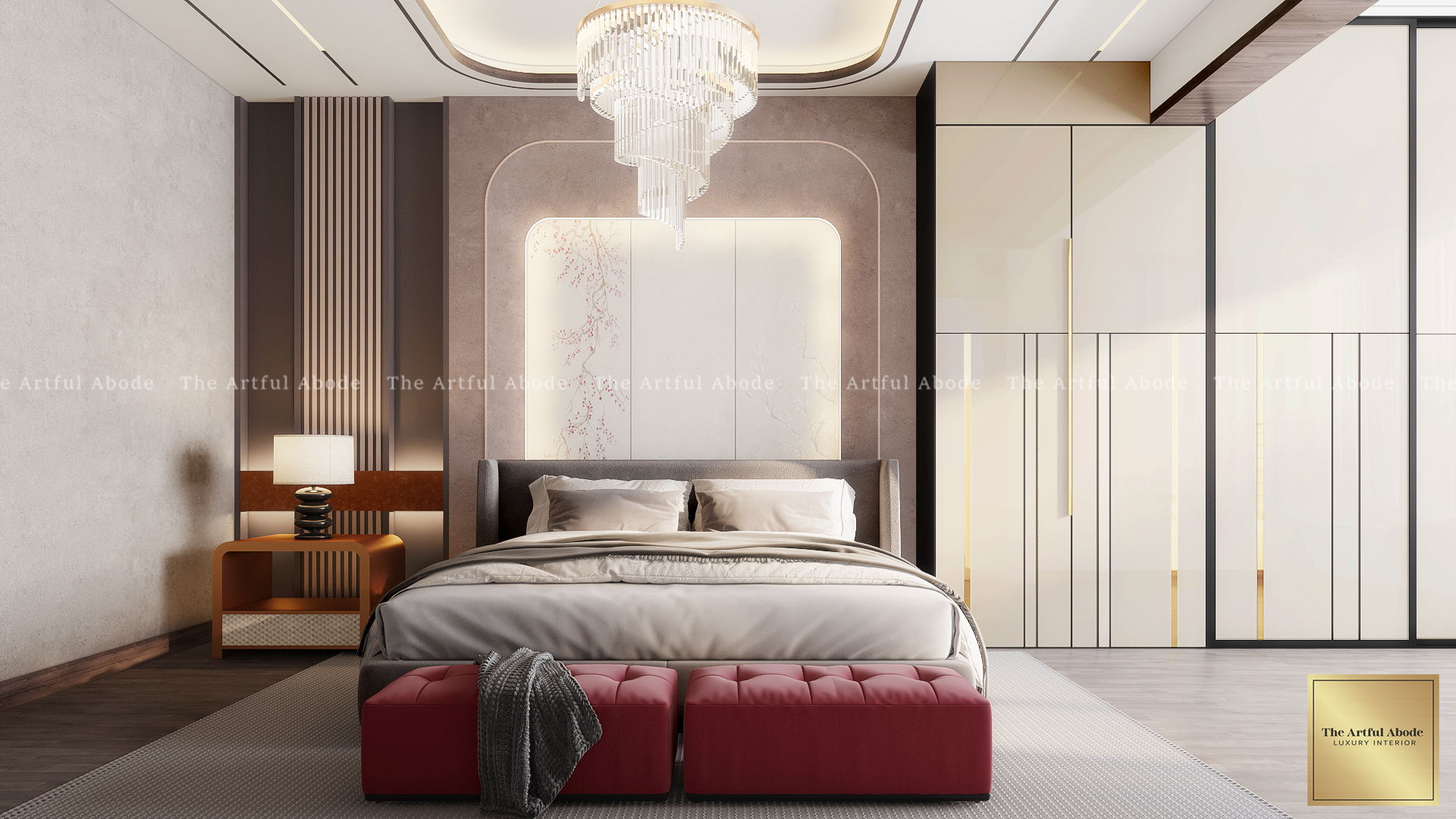
Most homes have one overhead light per room and a bedside lamp. Then people wonder why the space feels flat.
Professional spaces use three types working together:
Ambient for the overall room — ceiling fixtures, recessed lights. Gets you around safely but should not work alone.
Task lighting for specific activities — reading, cooking, working. These go where you actually do things, not where it is most convenient to install them.
Accent lighting to highlight a detail, a piece of art, an architectural feature. This is what creates drama and depth.
The thing nobody talks about enough: indirect lighting. Hiding the source and bouncing light off surfaces. LED strips behind headboards, cove lighting washing up onto ceilings, backlit bathroom mirrors. Direct lighting illuminates. Indirect lighting creates mood. That is the difference between a room that looks expensive and one that just has expensive things in it.
In our living room projects, we typically use 5 to 7 light sources on dimmers. Because morning coffee and evening drinks need different atmospheres, and a room that can only do one is only doing half its job. For kitchen lighting specifically, see our kitchen interior design guide.
These principles make more sense in the context of a real space. Book a free consultation with The Artful Abode and we will walk through how each one applies to yours.
Book a Free Consultation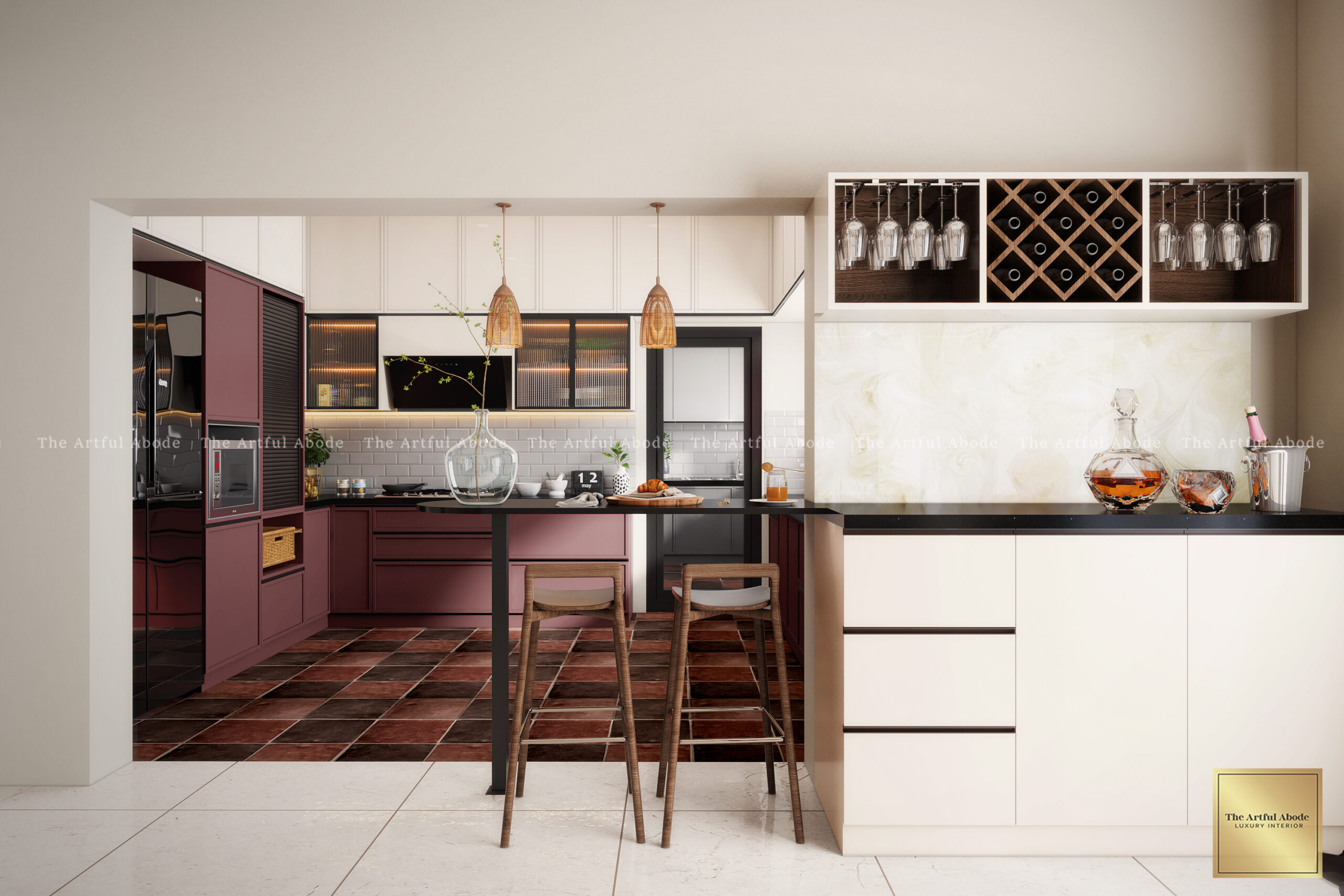
Ever walked into a room where something is clearly off but you cannot name what? Nine times out of ten, it is scale.
Coffee tables work best at two-thirds your sofa length. Nightstands should roughly match your mattress height. Rugs need to be large enough for at least the front legs of all furniture to sit on them — the single most common rug mistake in Indian living rooms is a rug that is just too small for the space.
These are not arbitrary rules. They are what makes a space feel visually balanced rather than random.
Breaking scale deliberately can also create real impact. An oversized piece of art. An unexpectedly large pendant light. Done with intention, these choices are stunning. Done by accident, they are just mistakes. The difference is the room having a clear focal point that the oversized element reinforces rather than competes with.
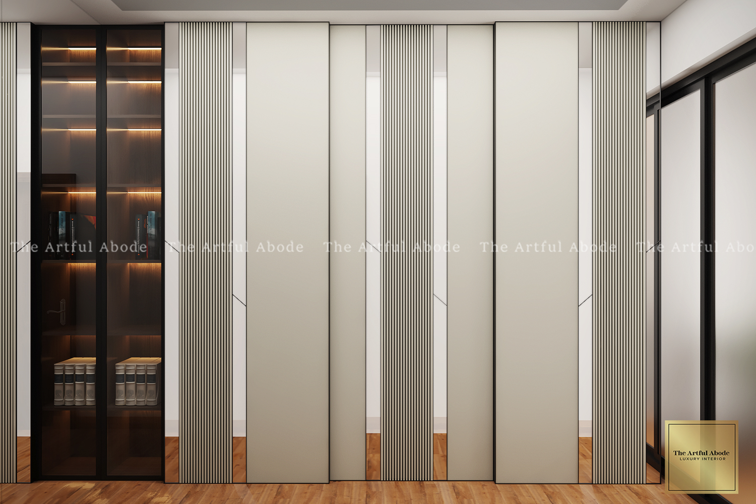
When everything in a room shares the same texture, it falls flat. Your budget becomes irrelevant because the space simply does not engage.
Contrast is what you need. Sleek leather with chunky knit throws. Smooth walls next to nubby linen curtains. Rough wooden bowls on a glossy marble surface. The contrasts give your eye something to move between without creating chaos.
Kitchens are where texture makes or breaks everything. Matte cabinets with a glossy backsplash. Smooth stone counters with textured bar stools. A honed island surface and a polished countertop. People feel these combinations even when they cannot name what they are responding to. That tactile quality is why a room with the right texture mix feels rich, while a room without it feels lifeless regardless of cost.
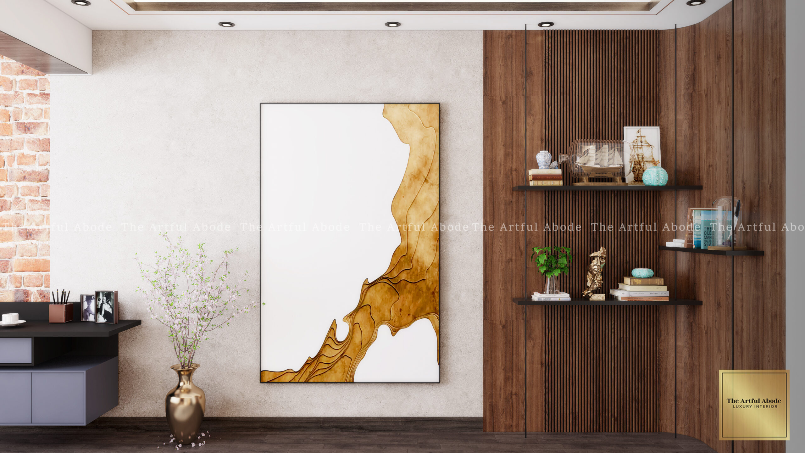
Every room needs something that draws attention and anchors everything else. A fireplace, statement art, an architectural detail, a view.
Without a focal point, rooms feel scattered. Your brain keeps searching for somewhere to rest and never finds it. Which translates into a vague dissatisfaction with the space that is very hard to diagnose.
No natural focal point? Make one. A bold accent wall. An oversized mirror. A dramatic light fixture. In most Bangalore apartments where the architecture is fairly standard, we build a custom unit or bring in one strong furniture piece that commands the room.
And once you have identified your focal point — arrange everything around it. Do not put your sofa with its back to a gorgeous window view. If there is a feature wall, face the seating toward it. Make the standout element actually stand out. Most rooms in Indian apartments have a focal point being ignored because the furniture was arranged for convenience rather than for the room.
Final Thought
Knowing these rules helps. But they apply differently depending on your ceiling height, which direction your windows face, and how much natural light you get. The 60-30-10 rule works differently in a north-facing apartment than a south-facing one. Scale decisions change with ceiling height.
That is not an excuse to ignore the principles. It is a reason to understand them well enough to apply them thoughtfully rather than mechanically.
The Artful Abode covers Whitefield, Koramangala, HSR Layout, Indiranagar, and surrounding areas in Bangalore. Book a free consultation to see how these apply to your home specifically.