Quick Summary
Living room colour selection principles, best colour combinations for Indian homes, room-specific recommendations, and what to avoid.
Key points:
- Indian natural light is warmer and stronger than most colour guides account for. Warm neutrals, terracottas, and earthy tones read better in Indian rooms than cool greys and blues.
- One accent wall behind the sofa changes the room more than repainting all four. Pick the feature wall first and choose everything else relative to it.
- Light colours dominate Indian living rooms for good reason. They reflect the available natural light, make smaller rooms feel more open, and work as a background to most furniture tones.
- Vastu recommends yellow, white, and green for living rooms. These align well with the warm neutral palettes that perform best in Indian light conditions.
- Test colour on the actual wall before committing. A swatch on a card tells you almost nothing. A painted section in the room tells you everything.
Want colour ideas, palette guides, and combination tips? Keep reading.
Designing your living room in Bangalore? Book a free consultation with The Artful Abode and let's get the colour plan right.
What Are the Best Paint Colors for a Living Room?
The starting point for any living room colour decision in India is the quality of natural light the room receives. South and west-facing rooms get direct afternoon sun. North-facing rooms get diffuse, cooler light. East-facing rooms get morning light and softer afternoons. Each of these responds differently to the same colour.
Warm tones in warm-light rooms amplify the room's natural warmth. In rooms that receive strong afternoon sun, a very warm palette can tip into feeling hot. A slightly cooler neutral, a stone or pale sage, balances it. In north-facing rooms with cooler light, go warmer than you think you need to. Cool colours in a north-facing room feel flat and cold in a way that's hard to fix with furniture.
Royal and Rich Paint Colours for Indian Living Rooms
Deep colours work in Indian living rooms when they're used correctly. Rich terracotta, deep teal, warm ochre, dusty plum on a single accent wall. The rest of the room stays neutral. The contrast does the work without making the room feel smaller overall.
Feature wall vs all-room colour: in a compact living room under 180 sq ft, all four walls in a deep or saturated colour closes the room in noticeably. The sofa, TV unit, and coffee table are already taking up significant visual weight. A feature wall gives the depth without adding that weight to all sides simultaneously.
What Are the Best Living Room Paint Colour Combinations?
Two-colour combinations that consistently work in Indian living rooms: warm white on three walls with a deeper warm tone on the sofa wall. Soft stone with a warm terracotta accent. Pale sage with a deeper olive feature wall. Muted ochre with a warm cream.
These combinations work because they're in the same tonal family. Warm with warm. Cool with cool. The moment you mix a warm main colour with a cool accent, the room reads as two separate decisions rather than one palette.
Neutral base with accent wall: the most reliable approach in Indian apartments. The neutral keeps the room feeling open and lets the furniture read clearly. The accent wall adds depth and character without committing the whole room to a colour that may feel different in six months than it did at the paint shop.
Complementary vs contrasting: complementary colours sit next to each other on the colour wheel and create harmony. Contrasting colours sit opposite and create tension. In a living room, harmony usually serves better than tension. Save high contrast for spaces where drama is the intent, not where you want to relax.
For detailed wall colour and technique guidance, see our wall paint ideas guide.
Which Living Room Colors Are Trending Right Now?
The cool grey palette that dominated Bangalore interiors for several years is giving way to warmer tones. Warm white, terracotta, warm rust, soft olive, and dusty rose are appearing in more living rooms than they were three years ago.
Neutral Living Room Paint Colors That Never Date
Warm whites and off-whites have never gone out of fashion because they work. They reflect natural light. They don't compete with furniture. They make rooms feel larger than they are. And they're easy to repaint when tastes change because there's nothing to fight against on the existing wall.
Earthy tones are gaining ground: warm beige, sand, mushroom. These are soft enough to use on all four walls without the room feeling confined, while still having enough warmth that the room doesn't feel clinical.
Soft greens are the current rising choice. Sage, eucalyptus, muted olive. They read as fresh without being stimulating. They work with both warm wood furniture and cooler metal finishes. And they respond well to both Indian natural light and warm artificial lighting.
What Are the Best Colours for a Living Room by Mood and Use?
Positive Energy and Vastu-Aligned Colours for Living Rooms
Vastu recommends yellow, white, and green for living rooms as colours that promote positive energy and well-being. These align closely with the warm neutrals and soft greens that perform best aesthetically in Indian light, which makes them a genuinely practical recommendation as well as a Vastu-aligned one.
Calming colours suit living rooms used for winding down in the evenings. Warm white, soft sage, muted stone. Energising colours suit rooms used primarily during the day for work or social activity. Warm terracotta, soft yellow, light coral.
Colours that make small rooms feel larger: light walls, light ceiling, same tonal family throughout. The room reads as one continuous space. Avoid strong contrasts between walls and ceiling in compact rooms. The contrast draws attention to the boundaries of the space.
What Are the Best Light Wall Colours for Living Rooms?
Beautiful Light Living Room Paint Colors
Light colours dominate Indian living rooms because they genuinely work. They reflect the available natural light, which most Indian apartments receive through limited openings. They don't absorb the warmth of the room's artificial lighting in the evenings. And they provide a background that lets furniture and textiles be seen clearly.
Warm whites vs cool whites: this distinction matters more than most people realise when standing in a paint shop looking at swatches. A cool white in an Indian room looks slightly blue or grey in natural daylight and distinctly institutional under incandescent artificial light. A warm white, one with a yellow or cream undertone, reads as clean and fresh while still feeling warm.
Soft creams and pale pastels: one step deeper than white. Pale butter yellow, soft blush, light lavender. These add character without committing to a full colour. They're particularly effective in rooms where the furniture is neutral and you want the wall to add a subtle personality.
How natural light affects light colour choices: test the colour at the time of day when the room is most used. A colour that reads beautifully in morning light can feel different in the late afternoon. Paint a 30 by 30 cm section and observe it for a full day before deciding.
What Are the Best Living Room Interior Colour Combinations?
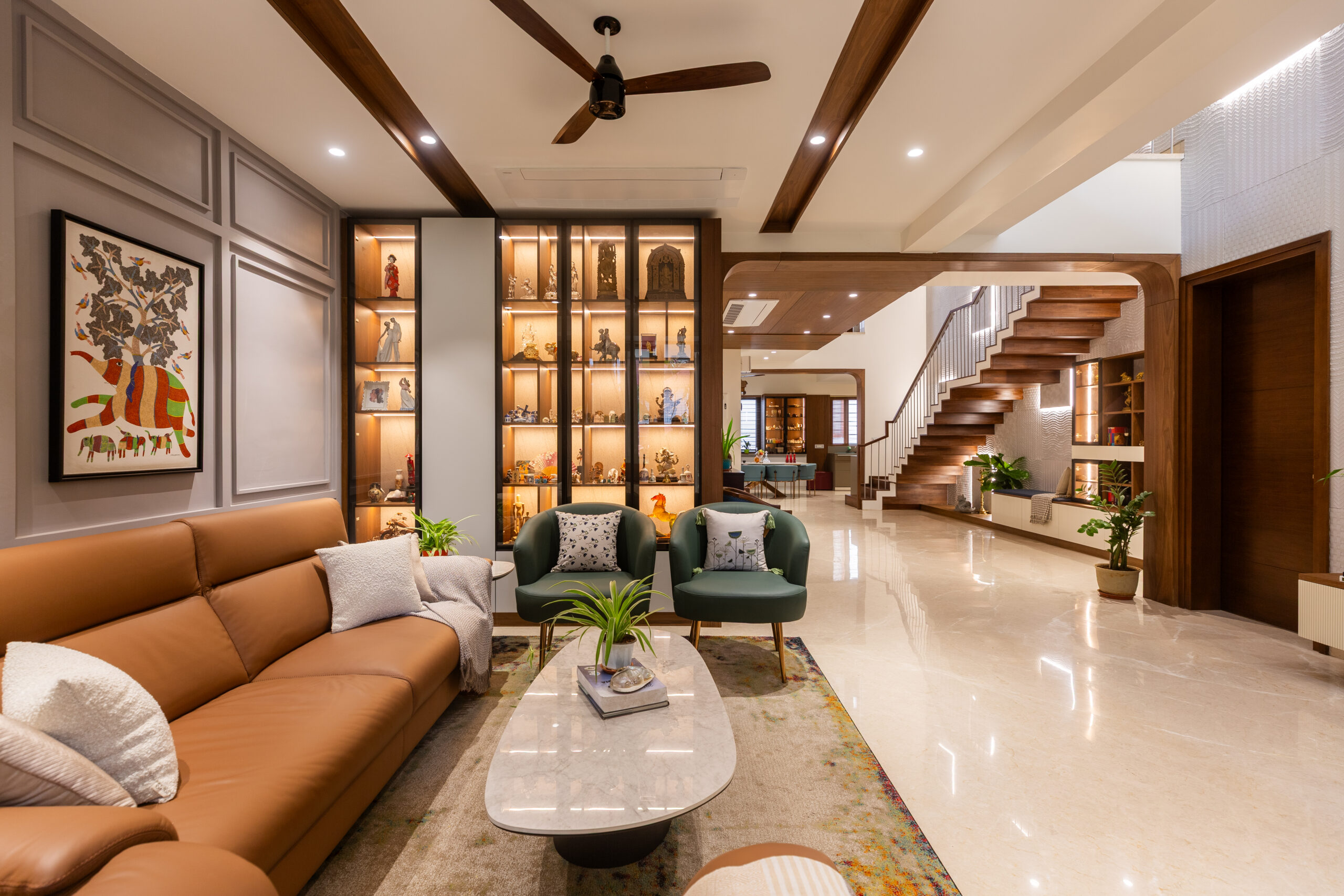
Furniture and wall colour pairing: this is one decision, not two. The sofa colour, the TV unit finish, the rug tone, and the wall colour need to be considered together. A warm beige sofa against a cool grey wall doesn't feel wrong in any individual piece. It just doesn't feel right as a room.
Floor, wall, and ceiling colour harmony: the floor is usually fixed, especially in apartments where tiles or wood flooring was part of the original build. Start from the floor colour and work upward. A warm-toned floor needs warm walls to feel connected. A cool marble floor can take both warm and cool walls, but the transition needs thought.
Indian material tones to work with: teak and sheesham furniture are warm and golden. White or cool-grey marble floors are neutral to cool. Indian handwoven textiles often have warm ochre, rust, or red undertones. Most Indian living rooms are already warm-toned by their materials. The wall colour should complement that rather than fight it.
Monochromatic vs contrast approaches: a monochromatic palette uses different shades of the same colour across walls, furniture, and textiles. It feels cohesive and calm. A contrast approach uses clearly different colours for maximum visual interest. Both work. Monochromatic suits calmer, more minimal rooms. Contrast suits rooms where character and personality are the priority.
How Do You Test and Commit to a Living Room Colour?
Test on the actual wall. Paint a section at least 30 by 30 cm in the final colour on the wall you're planning to paint. Not a swatch card. Not a photo on a phone. The actual wall, in the actual room, with the actual light the room receives.
View in different lights: morning natural light, afternoon natural light, and evening with the artificial lights on. The same colour reads differently in each. A colour that's beautiful in morning light and unpleasant under warm evening LEDs is a problem for a room used primarily in the evenings.
Coordinating with existing furniture: stand the paint sample next to the sofa fabric and the TV unit finish. The colour that looks perfect in isolation may read differently against the furniture you already have.
When to repaint vs refresh with accessories: if the colour is sound but the room feels dated, change the cushions, the rug, and the curtains first. These cost a fraction of a repaint and often solve the problem. If the colour itself is the issue, repaint the accent wall only. All four walls is a bigger project than most rooms need.
Planning Your Living Room Colour?
At The Artful Abode, we design living rooms across Bangalore 2BHK and 3BHK apartments. We plan the colour palette alongside the furniture and lighting - not as a separate decision. Get in touch and let's plan yours.
What Colour Mistakes Should You Avoid in a Living Room?
Too many colours competing. A living room with three wall colours, a patterned sofa, a differently patterned rug, and multiple accent tones in the cushions reads as unresolved. Pick two or three tones and let them repeat across the room in different proportions.
Dark colours in small rooms. A compact living room with dark walls and heavy furniture feels smaller than it is every day. Reserve deep, saturated colours for one wall only, and keep the rest light enough that the room breathes.
Colour that fights the furniture. A warm terracotta wall behind a cool grey sofa. A deep blue accent wall next to warm teak furniture. These combinations create a low-level visual discomfort that's hard to name and easy to feel. Plan wall colour and furniture together.
Choosing without testing. A colour that looked right in the shop, right on a phone, and right as a swatch on the wall can still read unexpectedly once all four walls are done. Paint one wall first. Live with it for a few days. Commit only when you're certain.
For the full wall design picture, see our wall design guide. For lighting that works with your colour choices, see our living room lighting guide. For the full living room context, see our living room interior design guide.